In the realm of landing page design, steering clear of common pitfalls is just as crucial as implementing best practices. Let's explore some real-life examples of landing page design mistakes and how they can impact user experience and conversions.
The Don'ts of Landing Page Design:
Cluttered Layouts:
Imagine landing on a page crowded with text, images, and links competing for attention. Instead of guiding your focus, the clutter overwhelms you, leaving you unsure where to look first. For example, a cluttered layout can resemble a crowded marketplace where every vendor vies for your attention, making it difficult to discern quality products from noise.

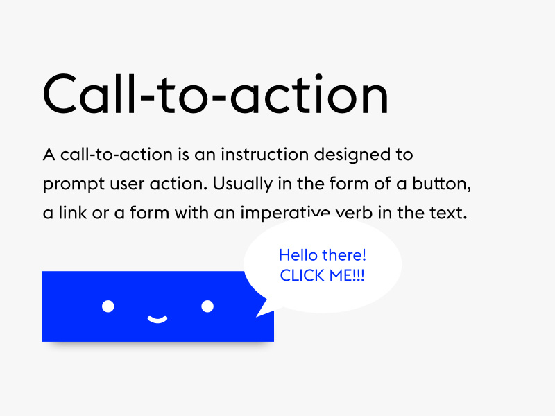
Unclear Call-to-Action (CTA)
Picture encountering a landing page with a vague CTA like "Click Here" or "Submit." Without clear direction, visitors may hesitate or navigate away altogether. In contrast, a specific and enticing CTA, such as "Get Your Free Trial Now," prompts action and guides users toward the desired goal. Think of a clear CTA as a signpost pointing the way forward, guiding users with clarity and purpose.
Slow Page Load Times
Have you ever visited a website that takes forever to load, testing your patience with each passing second? Slow-loading landing pages frustrate users, leading to increased bounce rates and missed opportunities. Just as a sluggish elevator tests your patience, a slow-loading landing page can drive visitors away before they have a chance to engage with your content.
Lack of Social Proof
Consider a landing page that lacks testimonials, reviews, or case studies—no evidence of satisfied customers or successful outcomes. Without social proof, visitors may question the credibility and value of the offer, hesitating to take the next step. Conversely, showcasing real-life success stories and endorsements builds trust and confidence, reassuring visitors of the offer's validity.

Poor Mobile Optimization
Picture trying to navigate a landing page on your smartphone, only to encounter text that's too small to read or buttons that are impossible to tap. A landing page that's not optimized for mobile devices frustrates users, leading to a poor experience and lost opportunities.
Just as a broken compass leaves you directionless, a poorly optimized landing page leaves users feeling lost and disconnected.

Overwhelming Forms
Imagine encountering a lengthy form requiring extensive information upfront. Faced with this daunting task, many users abandon ship, unwilling to invest the time and effort. Instead, keep forms short and concise, asking only for essential details. Think of progressive profiling as a friendly conversation, gradually gathering information as users engage with your brand.
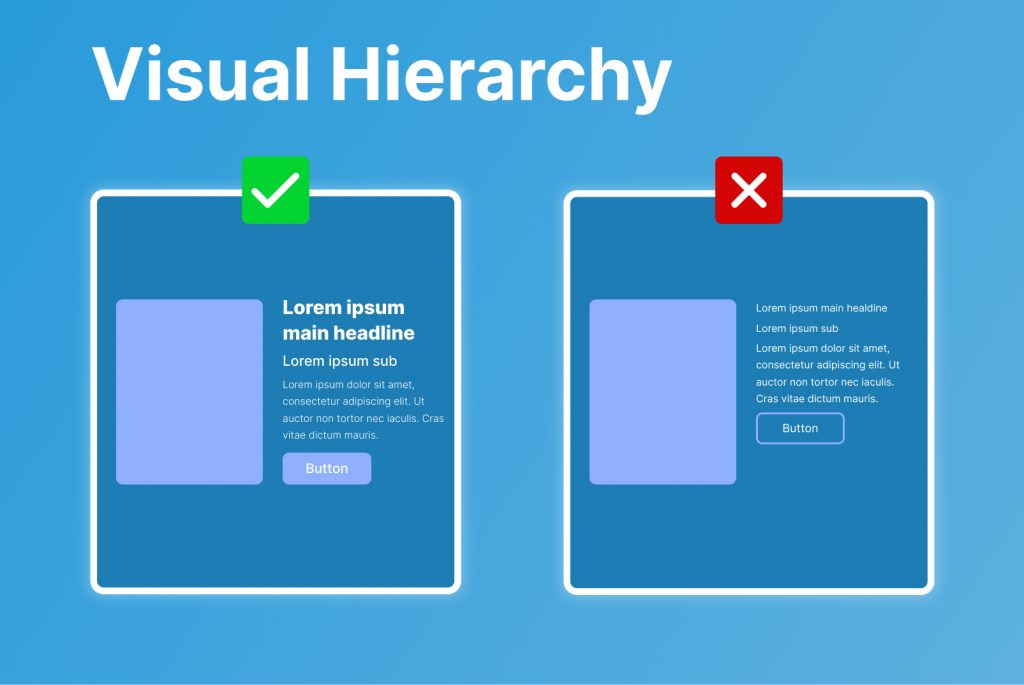
Lack of Visual Hierarchy
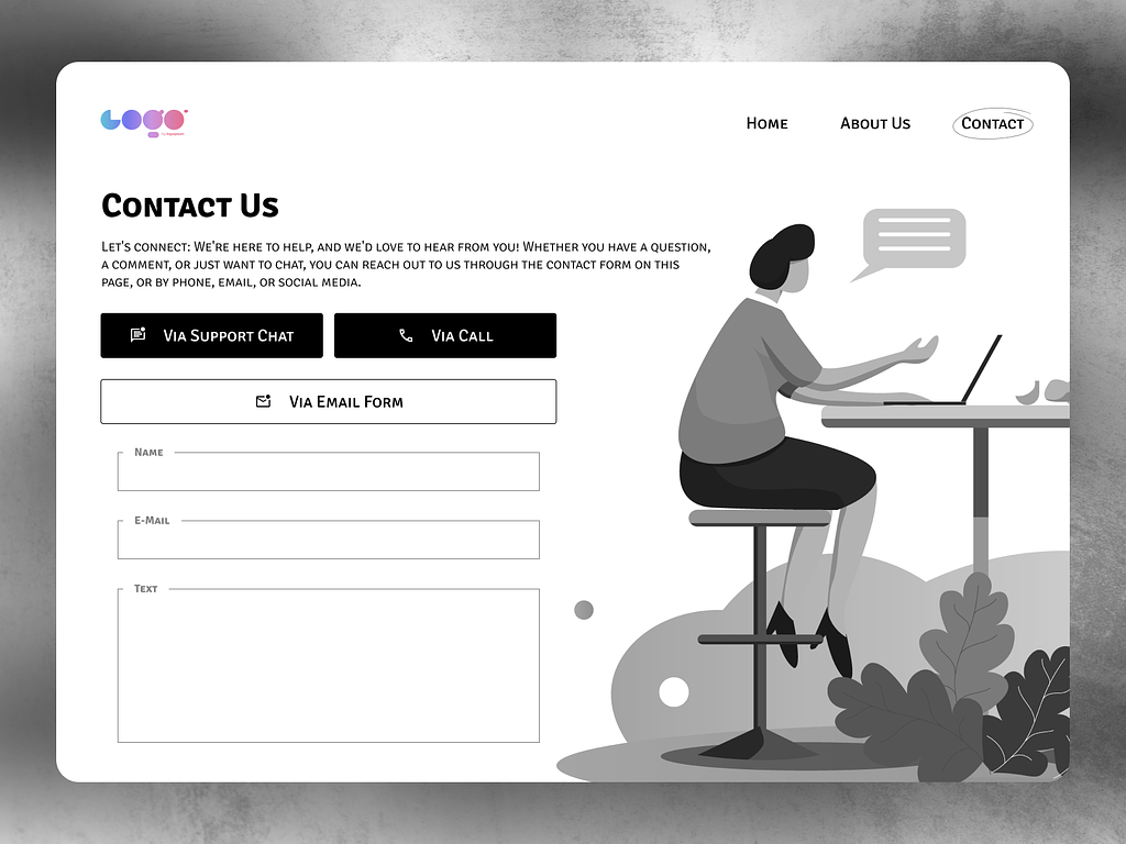
Consider a landing page where every element competes for attention, lacking clear hierarchy or structure. Without visual cues to guide their focus, visitors may struggle to prioritize information, leading to confusion and disengagement. Just as a well-organized bookshelf makes it easy to find your favorite novel, a landing page with clear visual hierarchy directs users' attention to key elements and messages.
Ending The Noted
By understanding and avoiding common landing page design mistakes, you can create pages that effectively engage visitors, drive conversions, and achieve your marketing objectives.
Remember, every design choice—whether cluttered or concise, vague or clear—shapes the user experience and influences conversion rates. So, strive for simplicity, clarity, and user-centric design to maximize the effectiveness of your landing pages.


